Wi-Tronix
Wi-Tronix creates software and hardware that powers safe, reliable, and sustainable railways. The technology company needed a website that explained its revolutionary SaaS products to an industry reluctant to change.
Role
Content Strategist
Associate Creative Director
User Experience Designer
Content Designer
Visual Designer
Year
2022
Team
Creative Director
Visual Designer
Project Manager
Front-End Developers
Studio
Glantz
Overview
Wi-Tronix's cloud-connected event recorders give railways remote access to real-time train data. But most in the industry still rely on locally stored data to investigate train delays and derailments. It is truly disruptive SaaS technology for railroads, yet Wi-Tronix struggled to explain it on its website.
I joined the website redesign team to execute its content strategy, user experience, visual design, and copywriting.
Process
Learning from subject matter experts
Wi-Tronix has several marquee features that pique customers' interests. But sales conversations broke down when representatives began to discuss SaaS and subscriptions. The website content strategy had to help them past this hurdle.
I conducted 10 hours of stakeholder interviews Wi-Tronix product owners, salespeople, and the leadership team. They walked me through the product functionality and industry challenges. The founders described their vision for the future of rail.
Insights from the interviews were integral to the website content strategy. I identified priority messages and keywords for each page, which I then activated in the copywriting.
A component library for content design
Every stakeholder had a story of a customer that converted during a demo. "Once they saw it, they believed it," they said. This insight powered the website's content design and user experience.
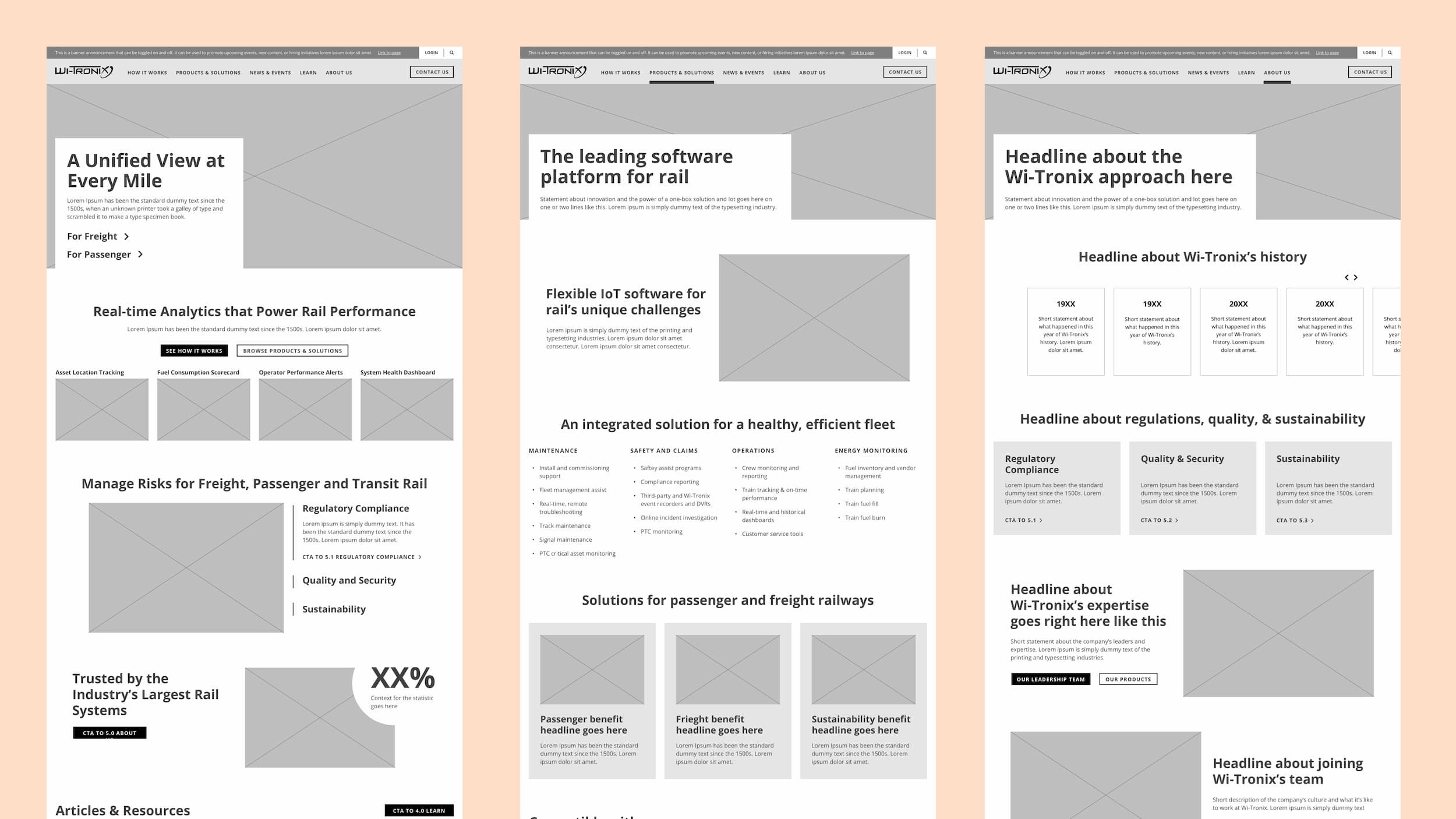
As a result, I prioritized "demos" of Wi-Tronix's hardware and software in the website's content design and user experience. I created a set of content components that supported varied displays of information. The component library was lean, but flexible. It allows for content and visual variety without disrupting user patterns.
I also collaborated with a junior visual designer to simulate a software demo. We created a set of illustrated product screenshots that described its most impressive benefits and functions. They give potential customers important product information in the format that resonates most.
Visuals to communicate speed and scale
Wi-Tronix sought a subtle brand extension in the website's redesign. They had branded colors and typography, but lacked a deeper visual language.
I leveraged the company's event recorder hardware to bolster the graphic library. The device's trademark purple tracks became a bitmap texture used throughout the site. The lined halftone screen amplified the image's speed. Rounded rectangles also convey movement, echoing modern locomotives and commuter train cars.
Stakeholder interviews
Wireframes using the component library
Simulated product demos
Initial design concepts
Final design with expanded graphic library
Outcome
Wi-Tronix's new content and website authentically represents its products and vision. The company was so satisfied that they commissioned me to write two articles for its blog. The first articulated the company’s software manifesto, and the second persuaded customers to buy software instead of building in-house.
“At the end of the day, Wi-Tronix has a mission of improving the operational efficiency, safety, service reliability, and sustainability of the world’s transportation systems,” said Chad Jasmin, Wi-Tronix VP of Sales and Customer Experience. “And to say our new website better communicates this is an understatement.”


