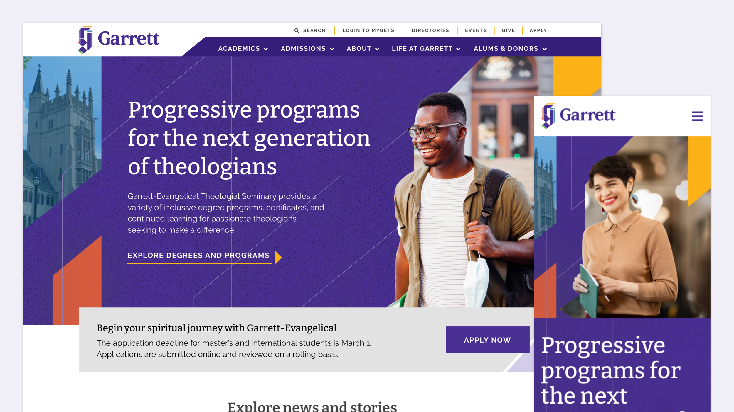
Garrett-Evangelical Theological Seminary
Garrett-Evangelical Theological Seminary is among the nation’s top graduate seminary schools. The university needed a website that helped potential students identify their call and affirm their decision to apply.
Role
Associate Creative Director
Content Strategist
Information Architect
User Researcher
User Experience Designer
Copywriter
Year
2022
Team
Creative Director
Account Director
Visual Designers
User Experience Designers
Account Manager
Front-End Developers
Studio
Glantz
Overview
The Garrett-Evangelical Theological Seminary website needed to be the university’s most powerful admissions tool. I joined the redesign and development team as associate creative director. I led the site’s content strategy, information architecture, and user experience.
Process
Research, hypothesize, and research again
I started with a content audit of the existing site and reviewed audience research conducted by Garret-Evangelical’s marketing team. This data helped me create user stories that hypothesized the content and functionality potential students would need and expect.
The user stories were the starting point for deeper inquiry. I led the UX design team in a series of user interviews. In each conversation, we uncovered insights about how potential students decide to apply, such as:
Academic programs are the first thing potential students check while researching a school.
Some seeking theological education aren’t sure which degree path will fulfill their calling.
Housing amenities are a major factor in potential students’ decision to apply.
International students expect details about visa applications and airport directions to the university.
I supplemented this first-hand research with market data from Garrett-Evangelical and qualitative studies from respected user research firms.
Organized and empathetic content
The website's information architecture needed a major overhaul. I started with a simple but impactful change: Moving the "Academics" section to top priority. This not only met user needs, but also aligned with Garrett-Evangelical's marketing approach.
I cataloged the new information architecture in two forms:
A visual sitemap for a zoomed-out illustration of the new hierarchy. This was useful for garnering stakeholder approval.
A numerical sitemap that detailed the content on each page. This was useful for the UX design, development and content teams as we executed our work.
To help students find their academic path, I crafted a content strategy that emphasized plain, empathetic language. For example, degree descriptions included "I statements" that illustrated a student's interests or desired career. These statements were useful for students and authentic to Garrett-Evangelical.
Test and iterate
The research and strategy gave me confidence in the user experience and wireframes. Yet some decisions begged for evaluation via user testing.
In particular, I focused on university housing, another important factor in a student’s decision to apply. I designed a user test with a script and prototype. It validated the housing page’s categorization in the IA and informed the page’s content and layout.
User stories and user interviews
Information architecture
Wireframes
Content strategy and copywriting
Outcome
Investing in user research and content strategy helped Garrett-Evangelical achieve its website goals. The Garrett-Evangelical website now operates as a high-performing admissions tool.


